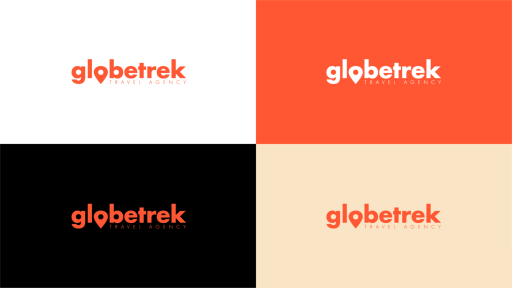
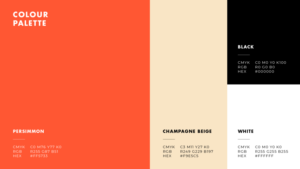
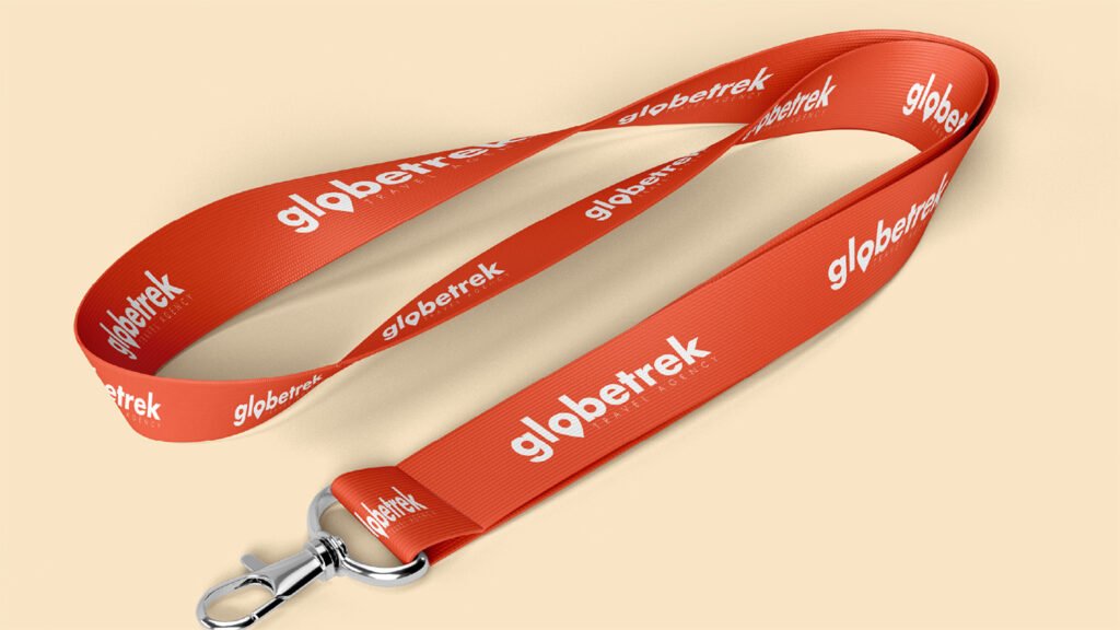
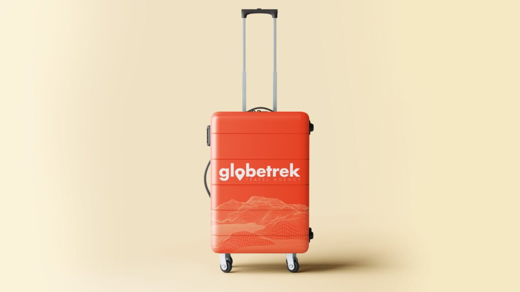
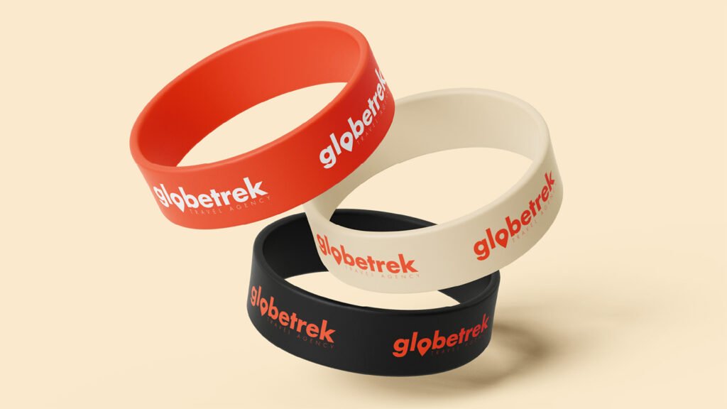
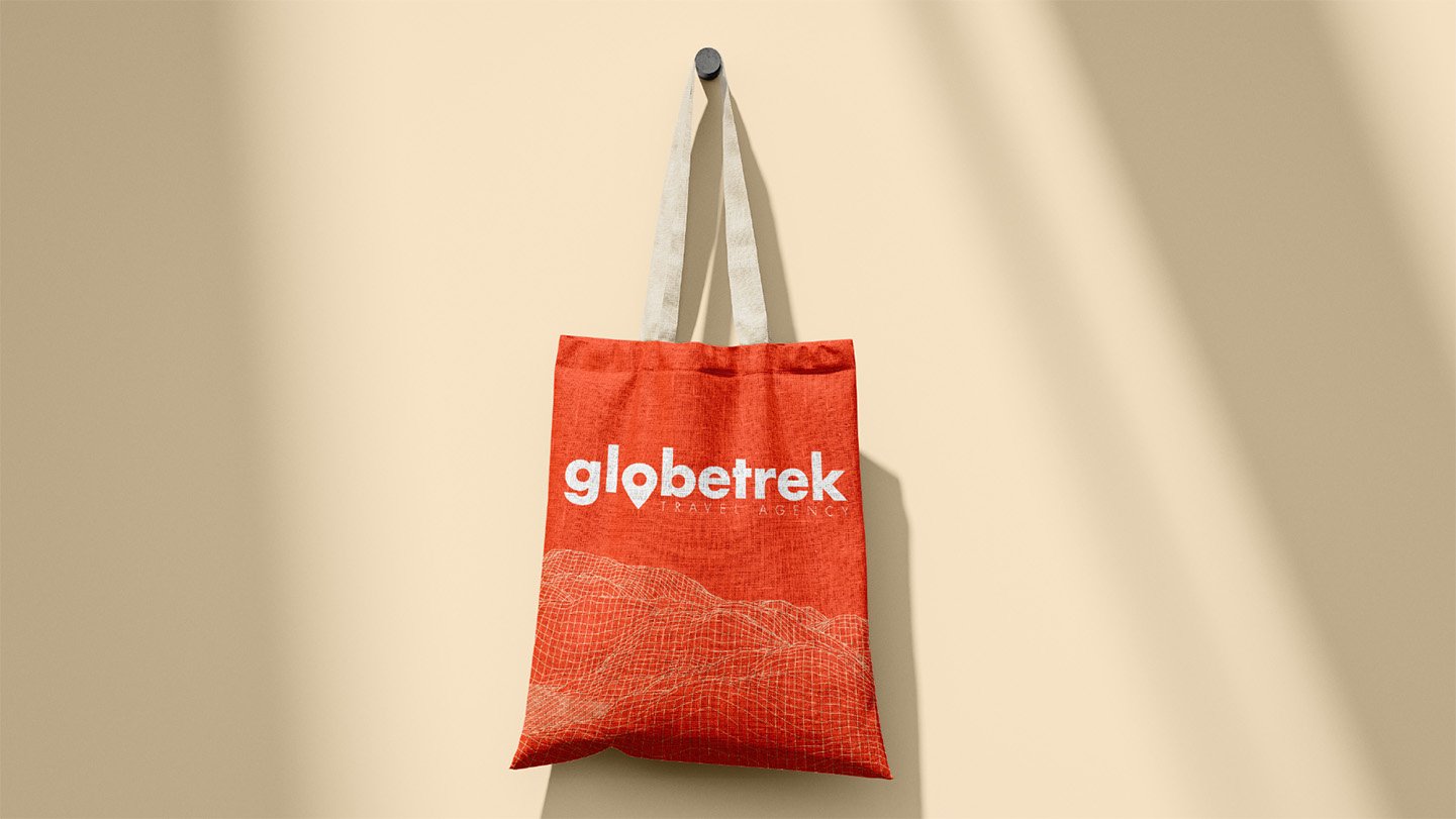
The Globetrek visual identity was created to reflect the excitement and freedom of modern travel. The clean, lowercase wordmark paired with a location-pin inspired “o” symbol represents exploration and discovery. A vibrant orange gradient forms the core of the brand, evoking energy, warmth, and adventure, while neutral tones balance the palette to maintain a polished and professional feel. The identity was applied across travel accessories, promotional materials, and digital touchpoints to create a cohesive and memorable brand experience for travellers.
Let’s talk about your project
Share your vision with us, and we will make sure of creating attractive designs for you.
We noticed you're visiting from United States (US). We've updated our prices to United States (US) dollar for your shopping convenience. Use Euro instead.Dismiss