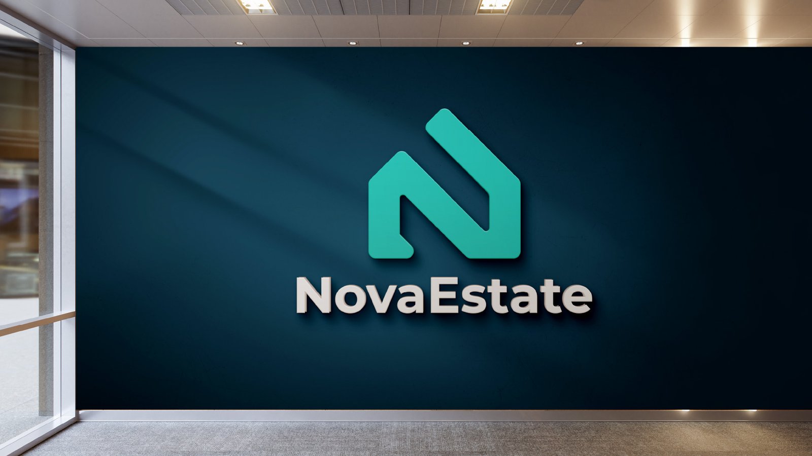
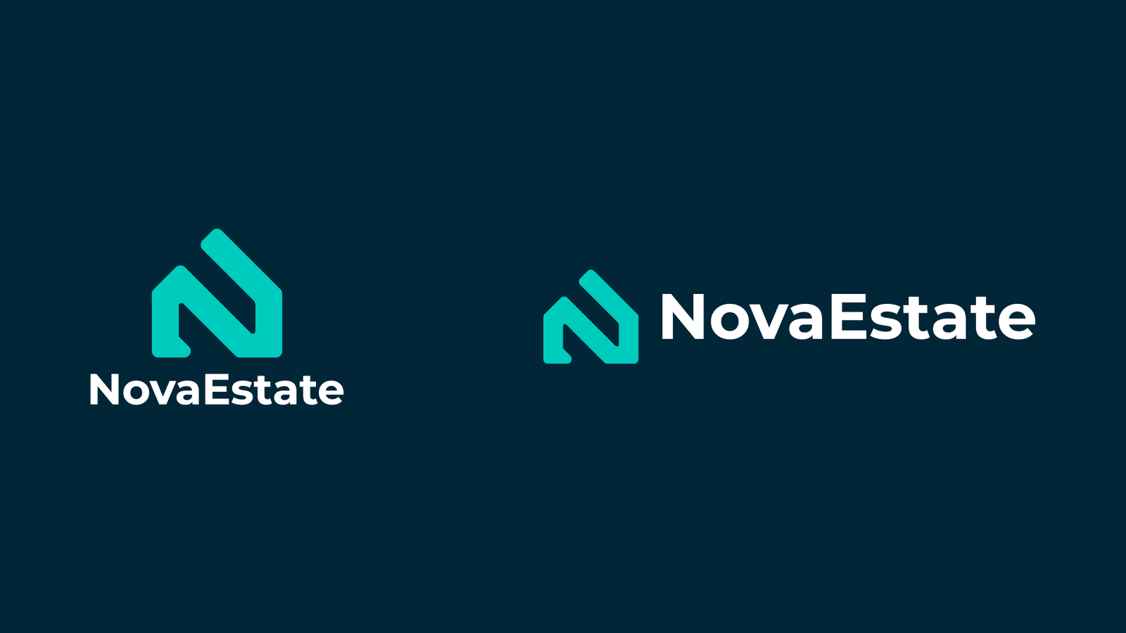
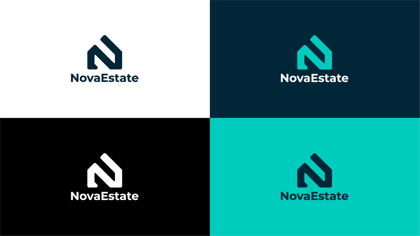
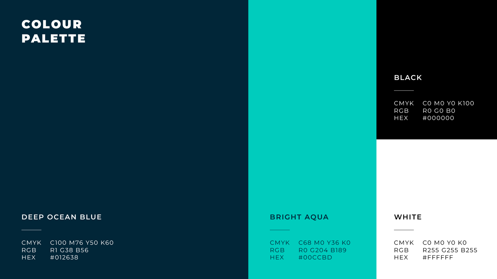
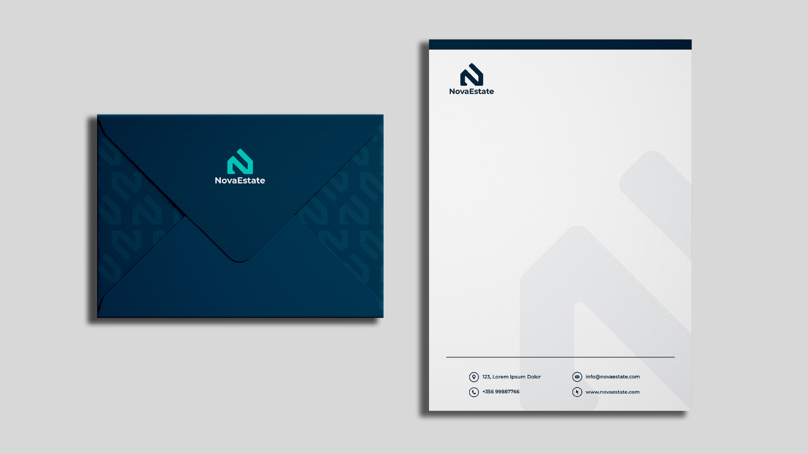
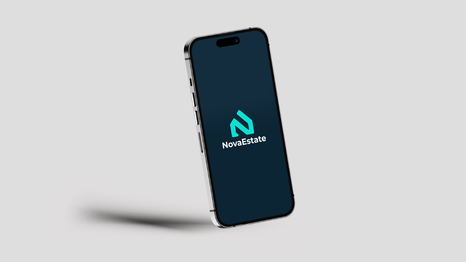
The NovaEstate rebrand focuses on creating a modern, confident identity that reflects the company’s forward-thinking approach to property. The new visual system centres around a bold geometric “N” mark, designed to symbolise growth, structure, and stability which are key values within the real estate industry. A refined colour palette of deep navy and vibrant teal reinforces trust and professionalism while adding a contemporary edge. Supporting brand elements, typography, and stationery were carefully crafted to ensure consistency across both digital and physical touchpoints, resulting in a cohesive and memorable brand presence.
Let’s talk about your project
Share your vision with us, and we will make sure of creating attractive designs for you.